
Client ·May 2026 → Jun 2026 ·live
Vanrox Group
A land surveying firm's website, built to turn a visitor into a booked site visit: a scheduling wizard on the firm's own calendar, a moderated review loop that sends the ask to Google, a blog, and an administration the staff run without a developer.
- Timeframe
- May 2026 → Jun 2026
- Tags
- Client work · next.js · supabase · lead generation
- Credits
- Xern Mottley — Engineer
- Links
- Visit the live site ↗
Where it started
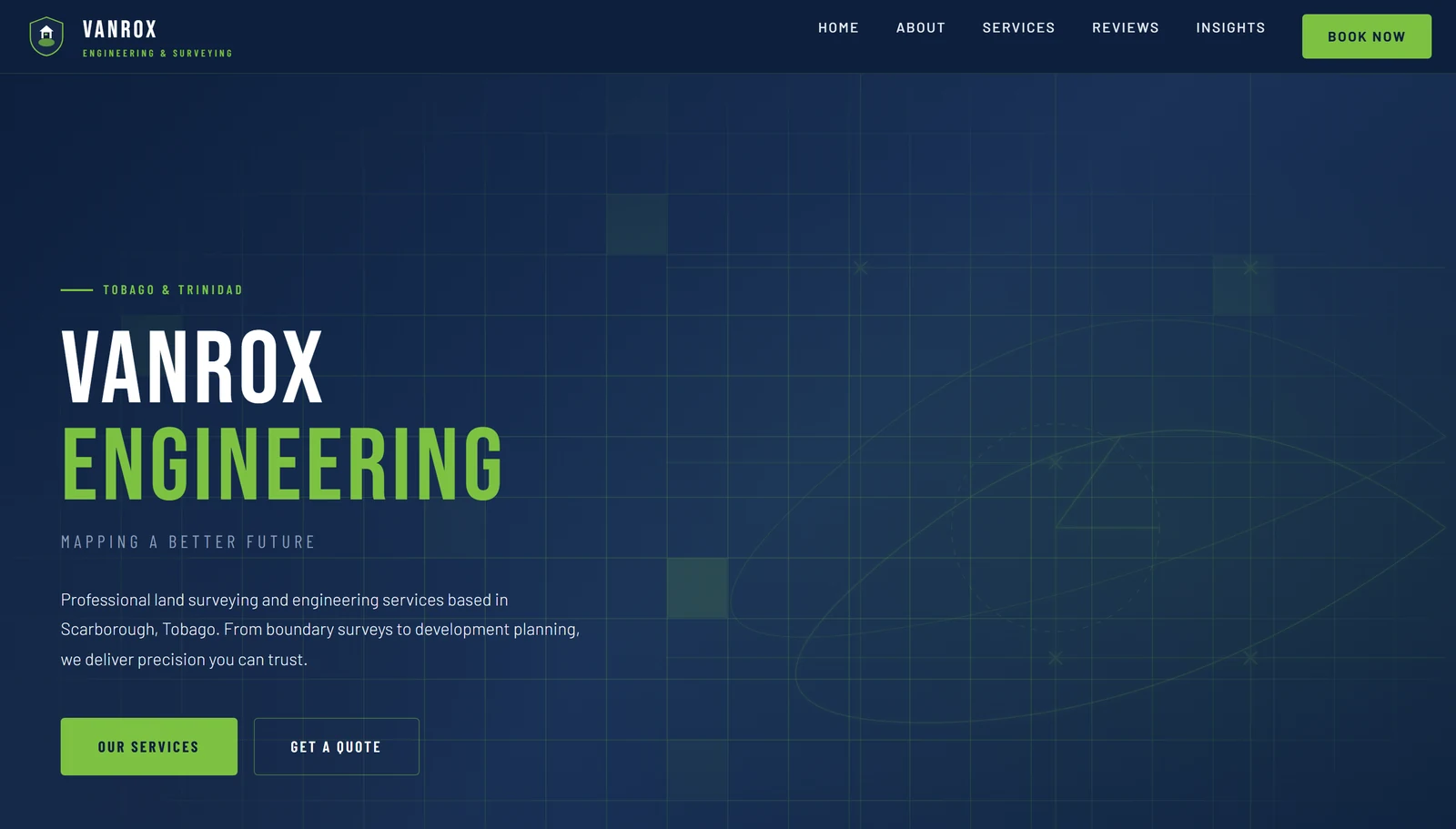
VANROX Engineering and Surveying Services is a licensed land surveying and engineering practice in Scarborough, Tobago, with a strong rating on Google earned in person. The reputation was real; the way to reach the firm was not. Someone who found it online had no way to ask for a survey, no page that said what each service involved, and no prompt to leave the review the firm had earned.
That was not a bottleneck in the early days. As the practice grew, it became one. The brief, scoped with the owner: show the services properly, let the firm publish its own articles, show the Google reviews it already had, collect new ones and send them to Google, and put a booking in front of every visitor — with an administration the staff could run after the handover without a developer.
What was done
A site and its administration on one schema, built from a written design specification that came before the first line of code.
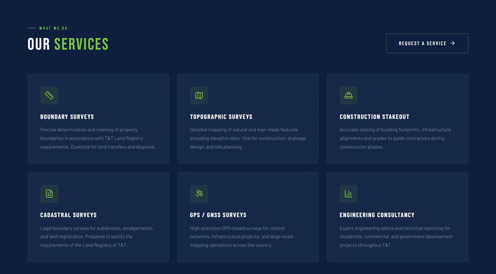
The catalogue: six services, each a link to its own page, with the request-a-service action beside them.
Six services from a catalogue the staff maintain, each with a page of its own. A booking wizard that takes a visitor from a service to a confirmed site visit — the hard part, below. A blog with a rich editor, cover photos and inline media, published as Insights. And the review loop the owner asked for.
Two sources in, one ask out. Google's reviews synced in as Google's; the site's held until a member of staff approves them; the button beside both sends a client to Google.
Google's reviews are synced in and shown as Google's, with the rating and count beside them. A review written on the site is held until a member of staff approves it, and only then shown. Next to both sits the ask: a button that takes a client to the firm's Google listing, to leave the review where it counts most.

The head of the reviews page: the firm's Google rating as context, the count beside it, and the site's own testimonials counted separately.
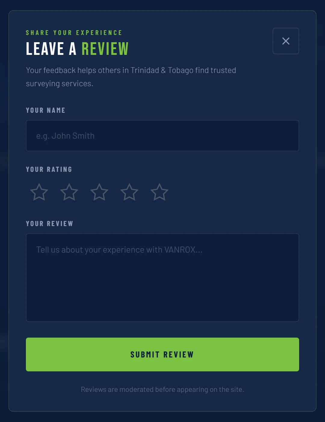
The site's own review form — a name, stars, words — held for moderation, as the form itself says. Nothing was typed.
Behind it, the administration the staff were handed: enquiries with their status, a scheduler with block-outs, the services and their pages, case studies per service, the blog, review moderation, a record of every notification, the firm's settings and staff invitations — and every change to a record logged.
What the staff manage after the handover: eight branches and twenty-four pages behind one sign-in, every change to a record logged.
And the developer's own work that a client never sees: a title and description per page, canonical addresses, Open Graph, a sitemap, a robots file, and structured data that tells a search engine this is a local business with an address and a phone number.
The decision that mattered
A form is easy. A lead someone acts on is the product. The design's own first rule was to build the administration before the public booking, because an enquiry nobody can act on is worse than no form at all.
From a visitor to an appointment: four steps in the wizard, one database function that re-checks the time and writes the customer and the enquiry together or refuses, notifications from a queue, and a person confirming in the scheduler.
The visitor's side is four steps: a service from the catalogue, a two-hour slot from the firm's availability with its block-outs removed, a name and a phone number, and a pin dropped on a map so the site is found on the day. Nothing reaches the database until the last step is complete.
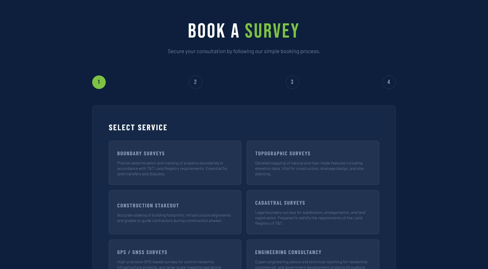
The booking wizard's first step: the six services, read from the catalogue the staff maintain. Captured locally; nothing was chosen or submitted.
The server's side is one function, or nothing. It checks the service, the time and the future, then checks the slot again — if it has just been taken, the request is refused with a reason the visitor can act on; otherwise the customer record and the enquiry are written together, with the site's coordinates, in one transaction.
Then the staff are told. An event is recorded once, with an identity that makes a repeat harmless, and delivered from a queue by email and inside the admin — never from inside the visitor's request, so a slow mail provider cannot slow a booking. A person confirms the appointment in the scheduler. A surveying visit is a decision, not an automatic booking, and the model was chosen for that.
Where it stands
Live since June 2026, handed over with a written handoff document, and run by the firm's own staff.
Nine commits between 25 May and 9 June 2026, two of them the design before the code; then live and handed over; then one day in September for the service pages, the mobile bar, the privacy policy and the design pass.
In September 2026 the owner came back with three things. The service pages had said nothing beyond the card's one line. Each of the six now carries a tagline, an overview and how the work proceeds — written for the firm to correct, and editable by its staff from the administration from here on.
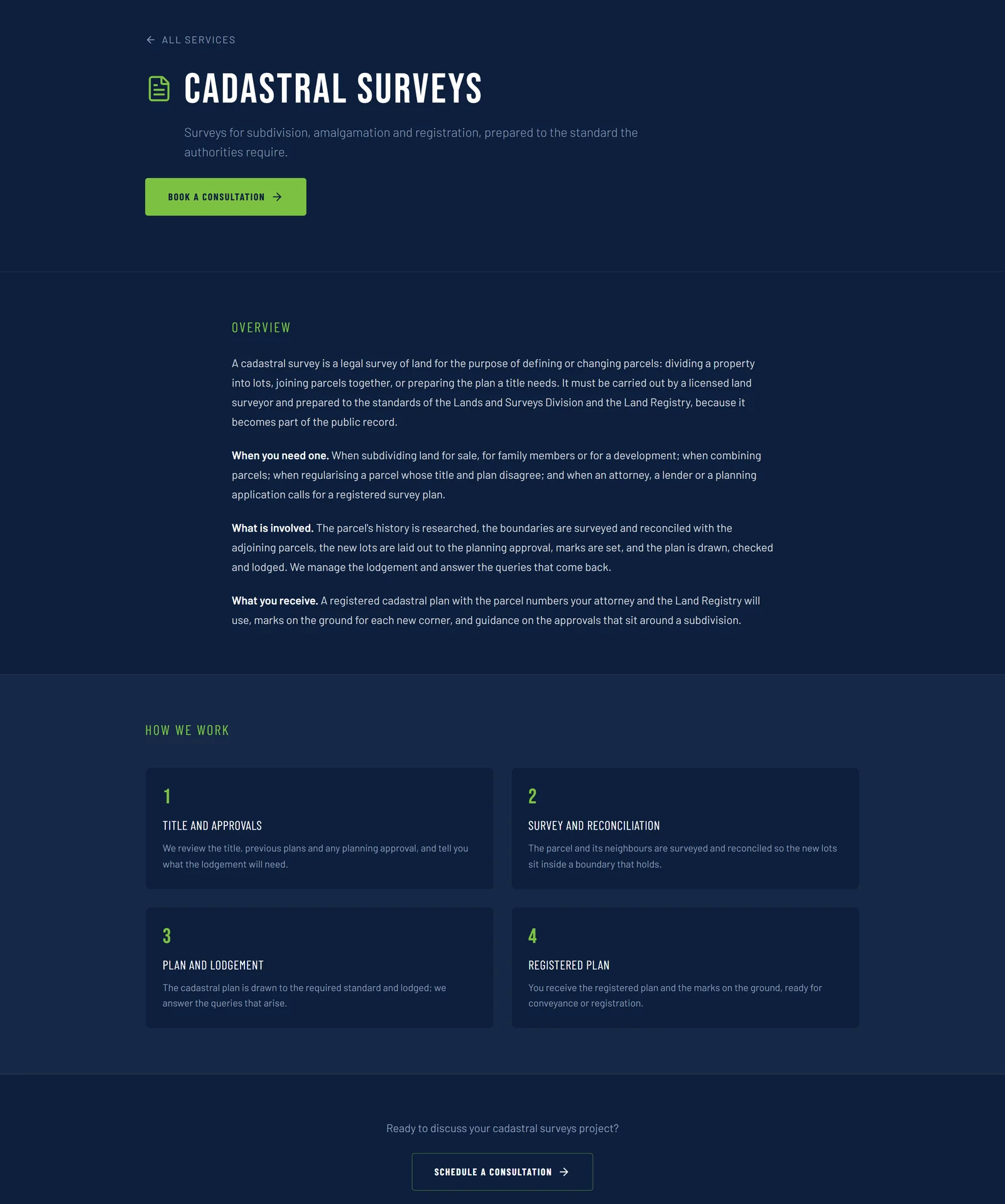
A service page with the content written in September 2026: a tagline, an overview, how the work proceeds, and the booking action. Editable by the firm's staff from the administration.
The mobile booking bar had been pinned to the bottom of every screen from the first pixel. It now arrives after the first screen has been read, and leaves while the footer or a page's own call to action is in view.

Before: the live site's booking bar, pinned under the hero's own two buttons from the first screen.
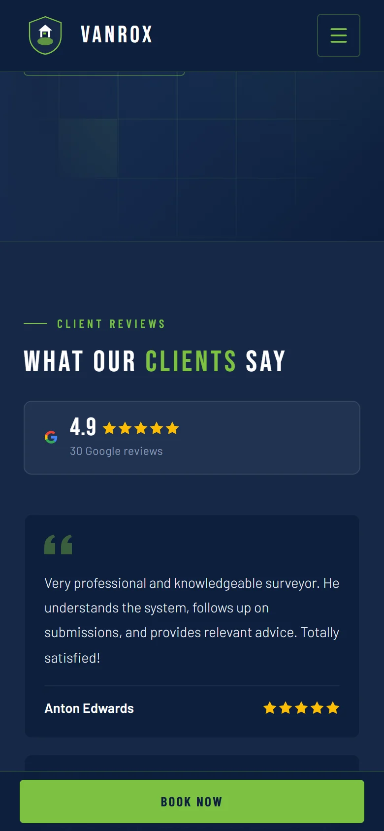
After: the bar arrives once the first screen is past, one line tall, and leaves again at the footer.
A privacy policy was added, written from what the site actually does.
Then a design pass against a written concept: the chrome quiet and square-shouldered, the product the survey, the proof the reviews.
One accent and nothing glowing. Flat cards. Two hover gestures. A shape for each kind of thing. Line icons in place of emoji. A footer that signs off, and a page for the address that does not exist. Everything shown on this page is the site's own surfaces, captured from the repository at that commit against the firm's own catalogue; no customer or enquiry appears, and the firm's claims in its own hero are the firm's.
Next — OPI Project Management →